
First impression of your website matters
Your customer actually spends the most time on your competitor’s websites.
Take this sentence in, let it settle.
And now think about it from another perspective - your competitor’s customers have checked your website as well. So why do customers leave your website?
We offer a potential answer – they did not understand who you are and what you offer.
Here is an example from our own experience showcasing how insights given by Unicorn Audit helped re-design above the fold location on a homepage.
Introductions
To start off you should know that above the fold location, know also as hero section or prime location, on the website is the area that customers see first upon entering a site without scrolling. A basic wireframe of a above the fold location must include six critical elements:
- the name and/or logo of the company – it does not need to be large but should be memorable if you wish to stay on your customers’ mind. Often the logo of the company is used as a Home button;
- brief explanation who you are – provide a tag line, a sentence that summarizes in short and easy everything that you intend to provide to your customer;
- preferable action – ideally guide the customer to 1 or 2 actions that you would like them to do once they have reached your website. One of them should be a distinguishable call to action ( CTA ) button for better engagement. It is a hard task to choose only a limited amount of preferred actions but do remember that there is the paradox of choice in play, meaning that too many choices gives anxiety to the customer;
- search field – make it easily recognizable as well as accessible for the customer from any page on your website. Of course it should have a great search engine beneath to make the best impact;
- classic visual elements – use such icons as shopping cart, magnifying glass, heart icon for wish list and so on. This is not the place to be clever and invent new symbols. Customers are used to particular icons, they give some sense of piece and control;
- navigation bar – the homepage is like a home base for your customer, once they get lost in the jungle of product items, they can always return there and start over their journey. Keeping that in mind design the navigation bar as simple as possible. Group similar items together, like shopping cart, wish list and login in on one side and product categories on another. Use as categories names the same words your customer uses, a common mistake in very specific areas is to use industry slangs.
In our example are using findings from CRO audit that we did in early 2021 for an online fitness accessory and clothing retailer Gornation. They are a calisthenics brand that provides the calisthenics and street workout scene with high quality sports equipment and stylish clothing. Gornation is not just a brand, but all employees are enthusiastic sportsmen and women and run the company with dedication and passion. Their goal is always to develop the products in such a way that the team likes to use them in their own training and to surpass the products of the rest of the market.
Before & After
Gornation had already a well-built structure and content for their website. Our aim on working together was find potential improvement areas and below in the 2 images you can see the result on how audit results helped to improve above the fold location on the website's homepage.
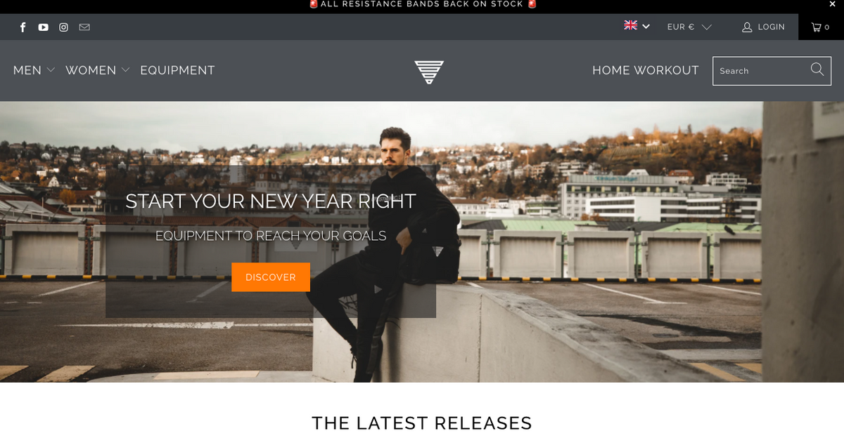
Before CRO audit
After CRO audit
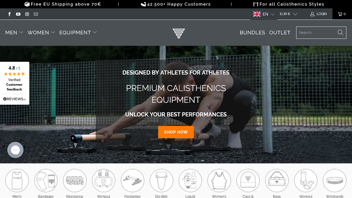
On Gornation website’s above the fold location there was an actual need to change 2 from 6 crucial elements:
- brief explanation of who you are:
- before – “START YOUR NEW YEAR RIGHT / EQUIPMENT TO REACH YUR GOALS” as a customer I get the sense that this should be about working out but missing a clear statement;
- after – “DESIGNED BY ATLETHES FOR ATLETHES / PREMUIM CALISTHETCS EQUIPMENT / UNLOCK YOUR BEST PERFORMANCE” a clear statement of who they are, what I can receive by being on this site.
2. preferable action:
- before – one CTA button “DISCOVER” as a customer I have a difficulty understanding is it a shop or another type of website, so this button confuses me;
- after – one CTA button “SHOP NOW” no doubt that this is an ecommerce website and as a first time visitor I get the message of what could be my next steps here.
One also important element that they did change is the graphical image and in this case it has a particular large impact is the combination with much improved brief explanation about themselves. Graphical images as such should not be a nice to have feature just so the website is decorated, they must continue the story you want to tell. The more on point they are, the more the customer will feel connected to the site. In the before image it is a more generic image with a male on the roof, as there is no story about calisthenics yet – so for the customer the image seems generic and disconnected. In the after image you can see a male in the middle of workout using a specific equipment – the image is on point as the story told in the tag line is about working out and having a great equipment.
Key takeaways to improve your website above the fold section
- Remember that your competitors’ customers view your website more often than your own customers.
- Tell your story. Who are you - company logo. What do you offer – a short but clear tag-line of the value you bring.
- Be relatable by using visual symbols and layouts that the customers is familiar with.