Top 10 website mistakes seen in our CRO audits, in 2021
Our customers are typically online stores, that are looking for conversion rate optimisation (CRO), by getting an independent expert view on their e-commerce platform.
Our analysis shows that the typical conversion bottlenecks are two: Homepage and Product page.
On the homepage, the most critical errors are observed in the Prime location, which is the "most expensive" area on the page, because most customers see it first and then continue browsing for specific product page. However, online stores tend to mess up this one expensive area the most:
- Call to action (CTA) button is missing (see #2)
- If CTA is there, button contrast with the background makes it unnoticeable (see #4, bad example in #8)
- Text is not readable because of low contrast and small font size (see #8)
- Homepage header is crowded with tons of categories (see #5)
Another conversion rate killing zone is the product page, where critical features are missing or wrongly implemented, like:
- Product description structure is missing or illogical (see # 3)
- 2-6 core values of the product are not easily visible (see #7)
Due to signed NDA agreements, examples in this article are not from our customers.
1. Missing social proof - Homepage
In short, reviews are influencing prospective buyers: “If others like this product, then maybe I’ll like it as well.”
Social proof and customer reviews are very powerful tools to inform and influence potential customers to buy from the store. In an online environment, customers can't touch, smell or try on the product and that makes purchasing decision difficult.
NN/g's study confirms, that if other customers’ opinions are positive, it increases website’s credibility and therefore removes decision making uncertainty from the potential customer. Gaining this kind of trust is especially important for young brands and less known or small businesses.
Solution:
- Get reviews from your customers
- Implement social proof section on the Homepage
- Be honest, reviews should be trustworthy
Read more about the topic here
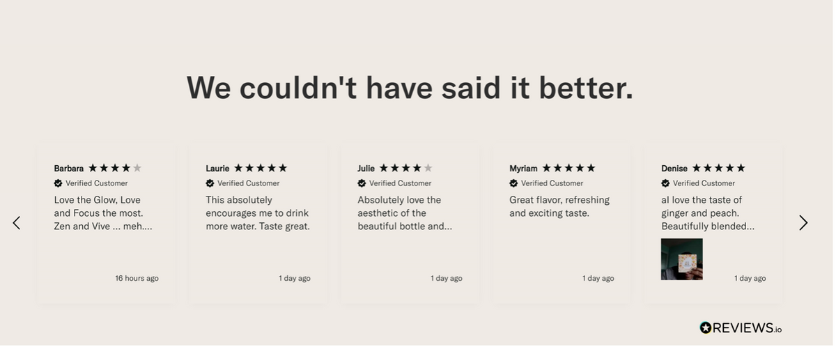
✅ waterdrop.com example: displayed reviews feel honest and trustworthy, as they display not only 5* rating, but as well 4* and lower
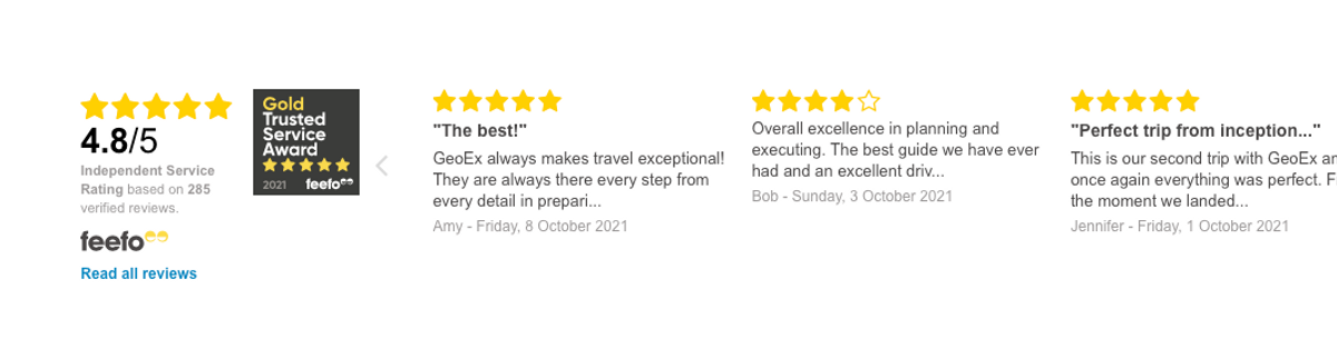
✅ geoex.com example: review summary shows a rating of 4.8 from 285 reviews, which gives additional credibility to the website, a link to read more reviews is also nice
2. Missing call to action (CTA) button in prime location - Homepage
It is possible to guide site visitors with call to action (CTA) buttons. Unfortunately, a huge share of customers actually miss these buttons completely. The importance of having a call to action button in the first window lies in customer behaviour and habits. Nielsen Norman group's study shows, that 57% of potential customers only see the first window and do not scroll down. As a result, websites without a CTA button lose the opportunity to sell more and improve their conversion rate.
Solution:
- Simply place the CTA button in a prominent location
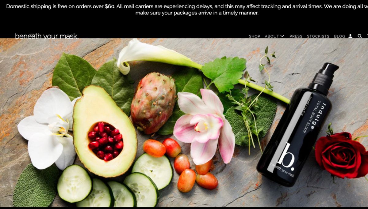
❌ beneathyooursmask.com example: prime location is missing CTA button. Visitors are not visually guided towards preferred activity, there is no "Shop now" or "Learn more" button. Do you see some other errors on this page?
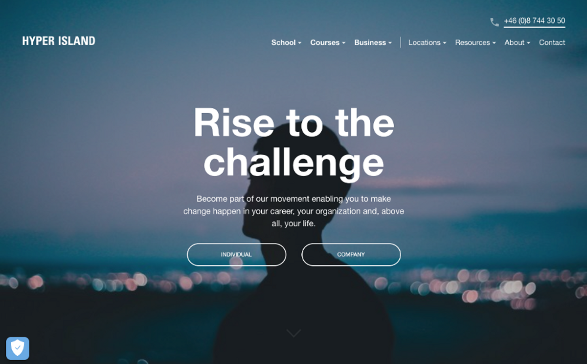
✅ hyperisland.com example: highlights two main activities in prime location: (1) choose between Individual or Company or (2) continue exploration with animated arrow urging to scroll down
3. Lacking structure and badly written information about products – Product page
Denmark’s Technical University study, has shown that our attention span, has dramatically shortened over the years, and on average it has dropped to 8 seconds. And now think about websites, that tend to go "all in", by putting a wall of text in the product description, forgetting to highlight 3-4 main product features that help customers to evaluate products and make a decision to buy or not.
Solution:
- Write text in a human language (no jargon, no sophisticated language that only a few understand)
- If the description is long - divide the text into sections. Have a title for each section
- Apply bullets if needed to better structure text and make it visually lighter and more readable
- My personal suggestion, make the description as concise as possible, use bullets and limit the text length so it can be read in 8 seconds rather than 2 minutes
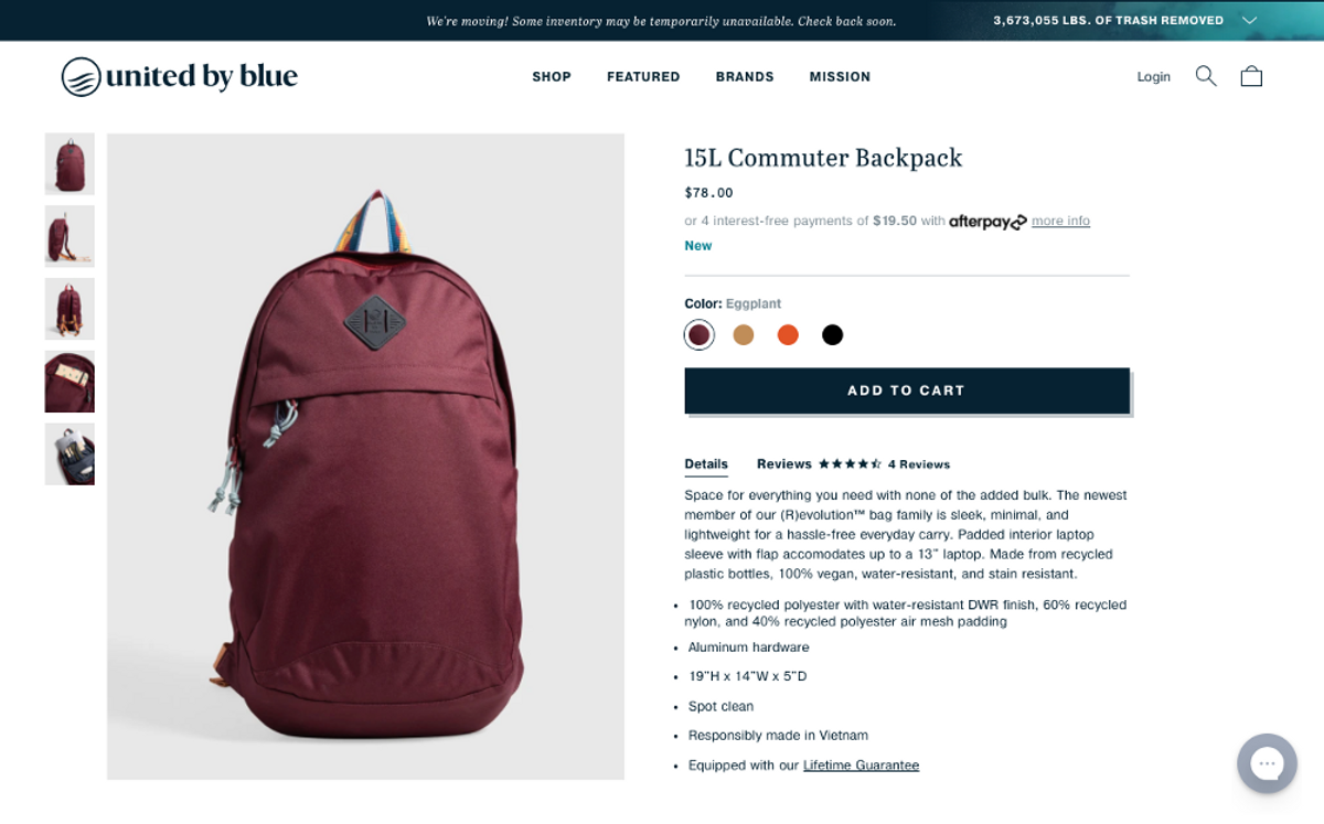
✅ Example: unitedbyblue.com has done it nicely, with bullet points to highlight key features and short product overall description.
4. Invisible Call to action button – Usability error
Call to action buttons (CTA) guide customers through their journey on the whole site, be it, exploration of the store, selection of products, going through checkout steps and so on. Imagine, customer likes a product, but is unable to see the button “Buy”? Well, the site might be losing sales.
Solution:
- Main rule is to have a CTA button in a proper size, distinctive colour and containing short power words, for example, if a store has a light blue background, use a highly contrasting colour like orange for the CTA button with white text, containing words "Shop now". Bright colours stand out more, but take away attention from other content, so be careful with that
- Psychological CTA rule – visually CTA buttons with rounded corners are much better perceived than squares, because people like curves. Rounded corners psychologically draw attention to text inside the button. There are tons of other interesting articles to deep dive into, like 7 tips to crafting compelling Call-to-action buttons.
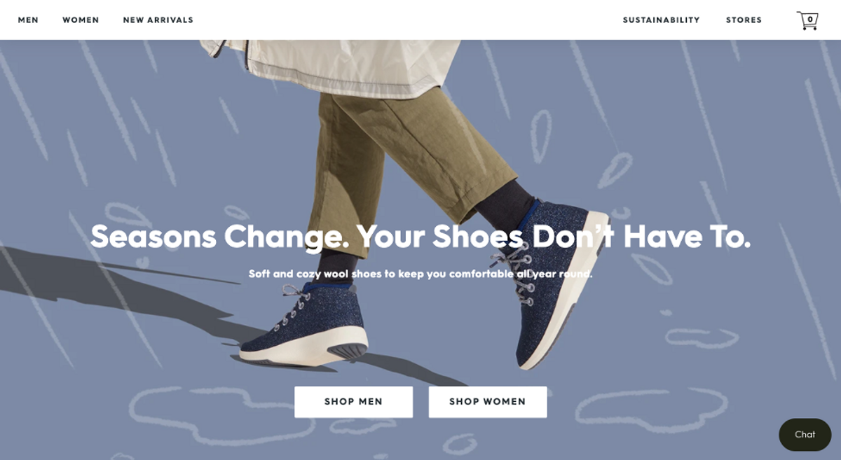
✅ Example:AllBirds.com has kept a visually appealing image and colour palette (just with few colours) and managed to distinguish between the call to action button with white colour CTA button
5. Crowded Menu bar with tons of items - Homepage/all website
Menu bar contains only the most important information, do not crowd it with unimportant information - “the more is better” do not work in this case. Customers get distracted and might not find the right information they need. When they can’t find what they are looking for, they go to competitor’s site.
Solution:
Items to include:
- company name/logo
- cart icon
- search icon
- sign in
- wishlist
- rest are up for each company, to decide, language, currency, geolocation
We see typical pitfalls: parameters are too few (for example, there is no search, wishlist features are not included) or everything is thrown there, like shipping information, social media icons and much more.
❌ Example of website, where header includes too many items - social account, shipping, payment information, different sizes of fonts and colours are used
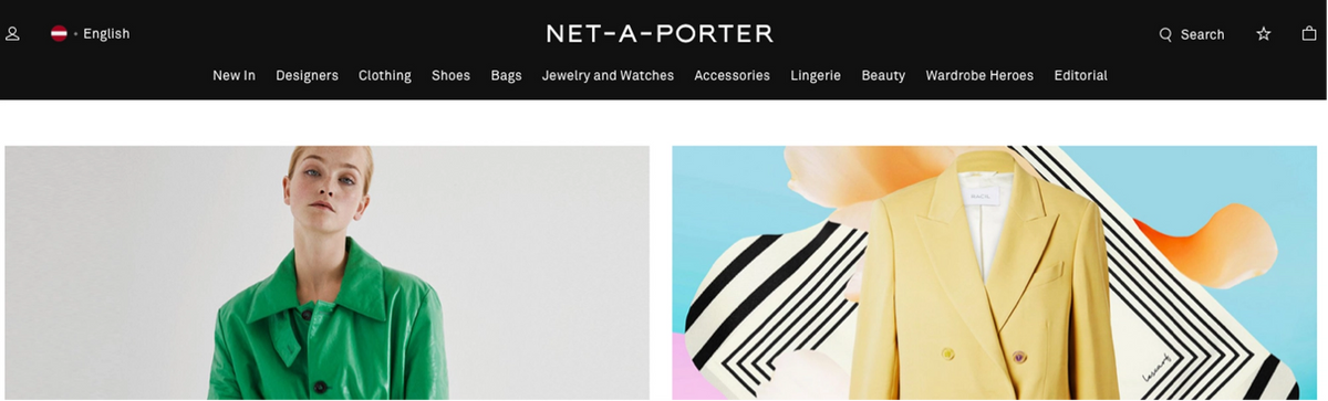
✅ net-a-porter.com example: page is neat, clean and only “must have” items are shown
6. Wrongly implemented Carousel feature - Homepage/ Full website
Carousel is super effective, when implemented correctly, unfortunately it rarely happens. Typical mistakes are: the carousel does not stop moving when user hovers; the carousel spins way too fast for people to read the text; the visuals for carousel do not fit its purpose, for example, too much text; missing carousel controls (arrows or dots) etc.
Solution:
- Carousel spin time – 2,5x times reading time
- Have as little text as possible
- Have carousel controls implemented
Read more - what to keep in mind when implementing a carousel here
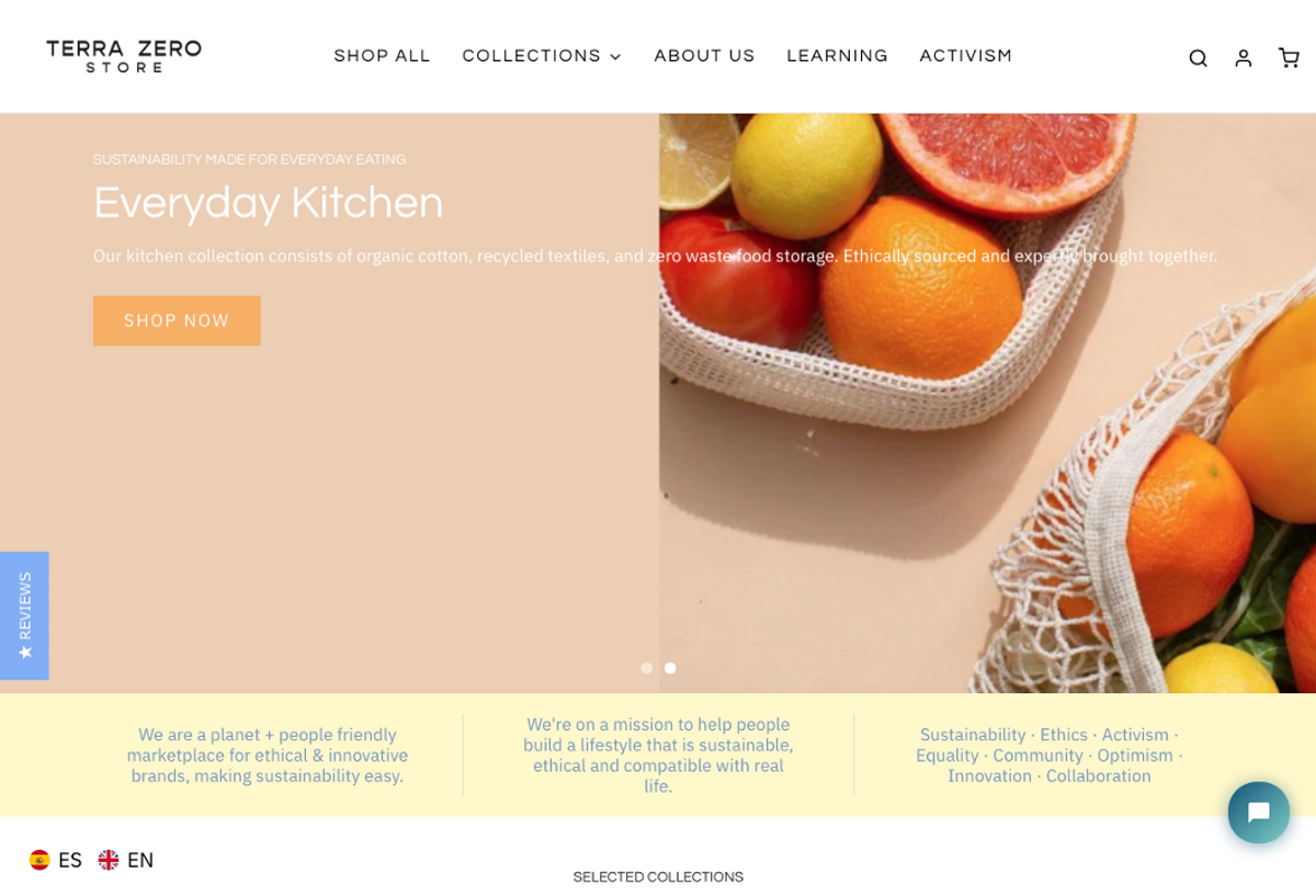
❌ terrazerostore.com example: carousel is moving too fast to read it, as well the text contrast and size is not user friendly. There are 2 dots at the bottom for carousel control (in this example dots are too small to be user friendly solution), there are no arrows on the right and left for customers to control the carousel if needed
7. Unique product features are not highlighted - Product page
Typical mistake we see is websites putting a wall of text in product description, without any separation or highlight of product unique features. Customers do not see, how this specific product is different or better than similar one, sold by competitors. This means, price comparison will be the main decision-making argument instead of product value.
Solution:
- For simple products it might be enough just to state features in bullets or with highlights in the text
- For simple product stating 2-6 core features is sufficient
- For strategically important and complex products – highlighting them with images/icons regarding the product is a great solution
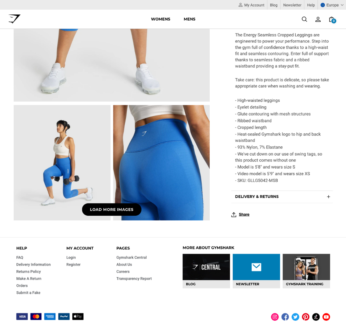
✅ gymshark.com example: concise summary of product description and key features
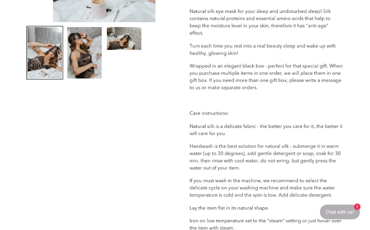
❌ katrinasilks.com example: unfortunately, customer with a short attention span will not read this wall of text. Suggestion is to highlight the most important parts and unique value adding points
8. Text is not readable due to text colour contrast and text size – Usability issue
The contrast of text defines how readable the content is. It is affected by the size, colour of the text and colour of the background. Text contrast should be checked against the desired level of accessibility.
Solution:
- If you want to evaluate your current website's accessibility, WAVE - web accessibility evaluation tool is one of the free tools to do it
- Search online for web content accessibility guidelines to get more familiar with the topic
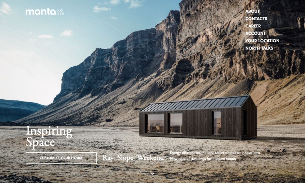
❌ mantanorth.com example: visually and emotionally inspiring Homepage, but the readability of the text is low, due to text colour contrast and image background. It's difficult to notice a call to action button with just a white border
9. Large-sized images or videos are not effectively used on prime location – Homepage
Prime location in Homepage (above the fold), is a place, where websites can connect with visitors through emotions, achieve business and branding goals, introduce the website and so on. We see that many websites make mistakes, by showing too much information and text in that small space or upload an image that looks like an advertisement or chose an image that does not create any emotions in visitors.
Solution:
- For the past years, large-sized images (standalone or in carousels) and videos have gained popularity. Images create emotions to feel urgency, desire, pity etc., so by posting the right image it is possible to draw emotions & engage with customers
Good article to know more about the basic image principles for Homepage.

✅ nptrust.org example: emotional attachment created by image, company's value proposition is clearly visible
10. About us section is low quality or not even included - Homepage
Introduction to the store or website (what you do? how you do it? who you are? what are your goals and mission? etc.) is a must. The reason is simple, potential customers want to understand if a website is selling needed products/services, gain confidence and trust in the company and only then are they ready to buy. Unfortunately, this is one of the most overlooked sections when developing a website and some sites don't even have an "About us" section as such.
Solution:
- Have “About us” section
- Make it easily accessible from Header and Footer
Read more about why it is needed. Here is a good summary on what to think about, when writing an "About us" section (for B2B and B2C business model), based on extensive expert design reviews and qualitative user testing methods.
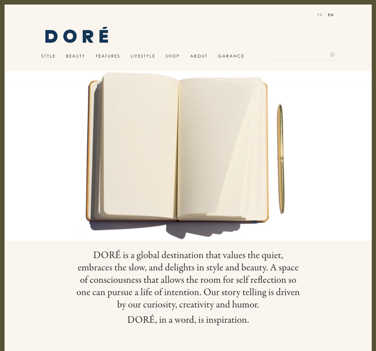
✅ wearedore.com example: there are different options and ways on how to write good About section. One of traditional ways of conveying your company's vision, mission and employees is by showing people working in the company. It brings trust and connection. The uniqueness of this example is that even without people behind the company with powerful image and great copywriting they created an emotional connection between customer and company. When scrolling down the page, there are names of people working in the company, but there are no "faces", and it is fine as well
Conclusion
Many of you would say that these are quite simple and obvious mistakes and I would agree with that.
I think it is difficult to run a business, especially a small business, where few people need to be experts in everything: in business operations, finance, product/service design, product development, sales, marketing etc. It is just too much to handle for them. It is not that they do not want to have an amazing site, believe me, they do. Therefore, my suggestion for them would be, to find a company that will help and explain how its website should be improved for a better customer experience and conversion rate.
Analysis methodology
Results are drawn from more than 100 audits we have done in summer 2021, either those are Unicorn Audit paid customers or companies, that applied for our free website audit service. All companies are located in Europe, Canada or US. Top 10 mistakes are drawn from a combination of all pages audited: homepage, product list page, product pages, checkout pages, search page, account pages etc. In this analysis I looked at the desktop versions only.
Want to learn what your website's mistakes are?
Apply for a free mini audit here
Get in touch with us: info@unicornaudit.com